
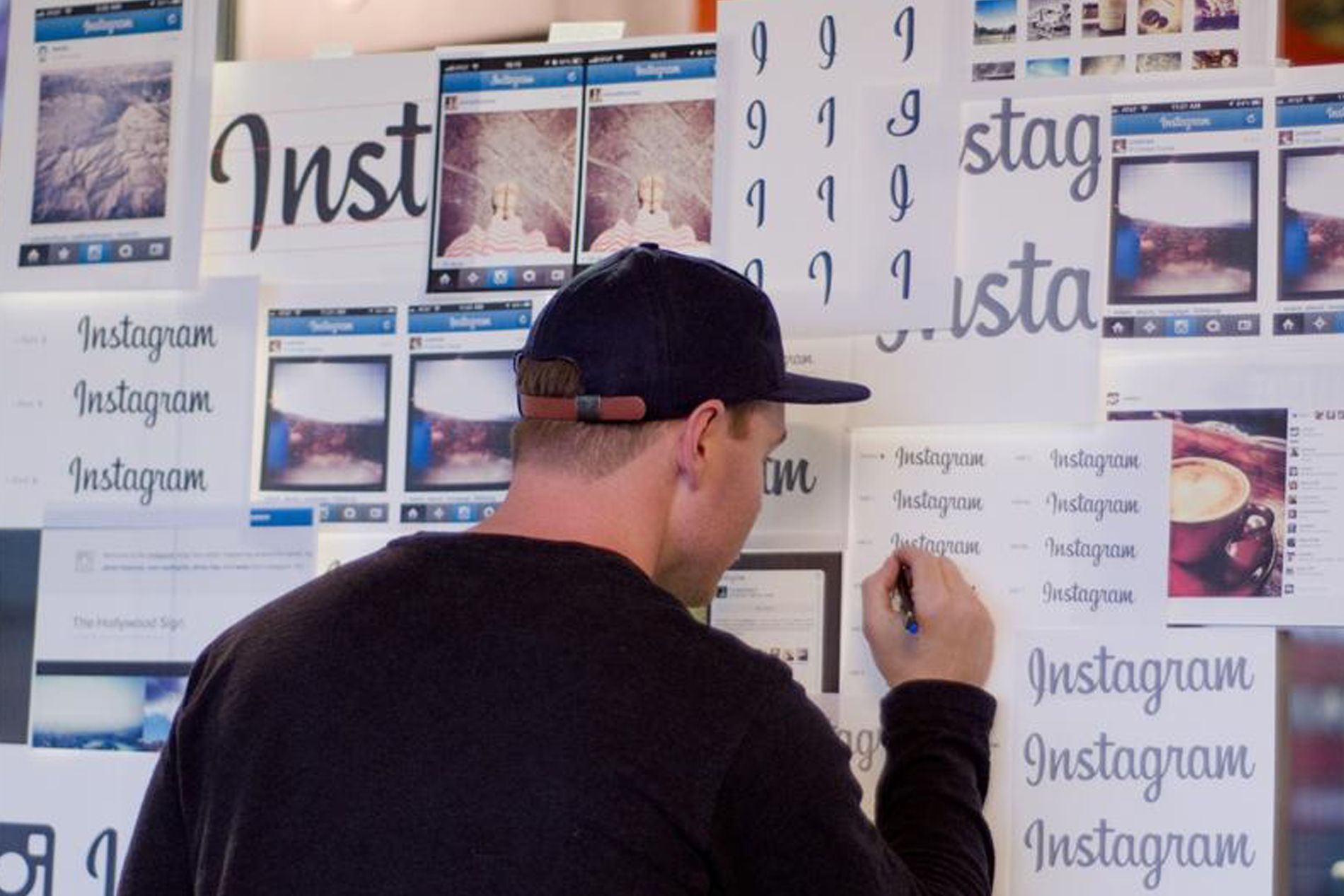
Mackey Saturday is a Denver-based graphic designer who was given the task to create a new logo for Instagram. The old logo was based on the Billabong font, a retro hand lettered script font.
To most people the new changes probably aren’t that noticeable but to the trained eye there are some key changes. The first noticeable difference is the capitalised “I” now looks more like an “I” and less like a “J”, and the small “s” loses its straightforwardness for a more stylised script version that connects to the “t” much better than that of the previous logo. The connectivity between the letters looks more fluid and is much more aesthetically pleasing.
The new logo Mackey has created is more refined and mature and I’m sure will be in use for many years to come.?
Below are some images of the design process. Follow Mackey via his Instagram page or check out his website.


