
As a designer I’m always looking for fresh and interesting typefaces to inspire my work or give a new lease of life to a project where we need to update something that already exists.
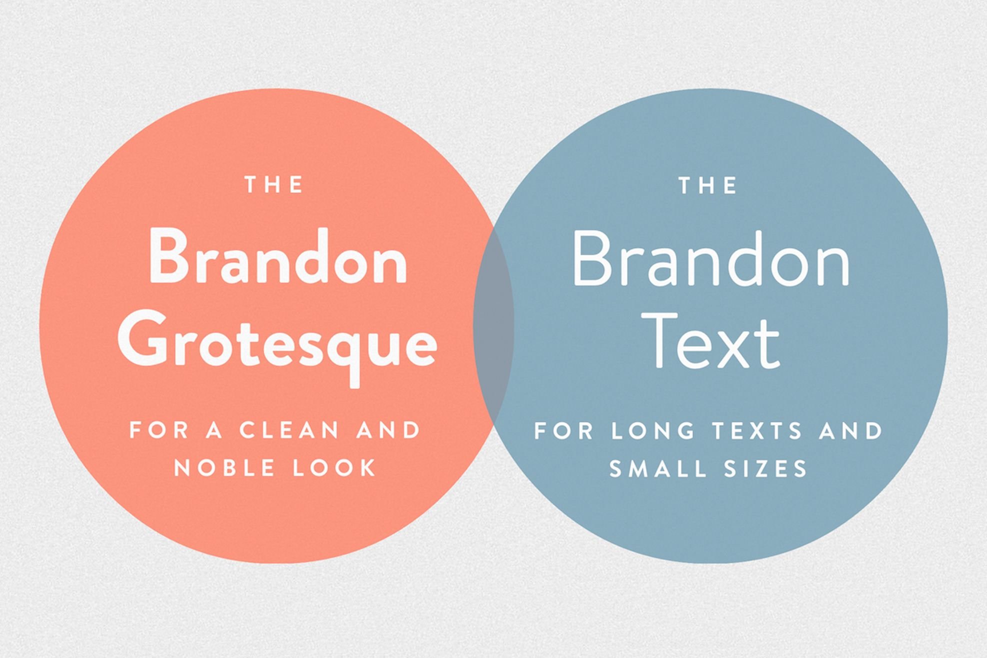
There’s a great font on the type scene that I feel caters for both of those needs really well – Brandon Grotesque. It’s an award winning sans serif family and was designed by Hannes von Döhren. Not only is the font award winning but it was the best selling 2010 serif release overall
Its influence comes from the geometric-style sans serif faces that were popular in the 1920’s and 30’s. Brandon has a functional look but seems to me to create a friendly, personal touch, while the long ascenders and descenders add style.
The lighter and middle weights of the font family are more elegant but even the heavier weights give the typeface a softer look even when used at a larger type size.
Give us a call if you would like us to hit your new project with some Brandon Grotesque sparkle, it could add that extra cutting edge to your new logo or brochure.


