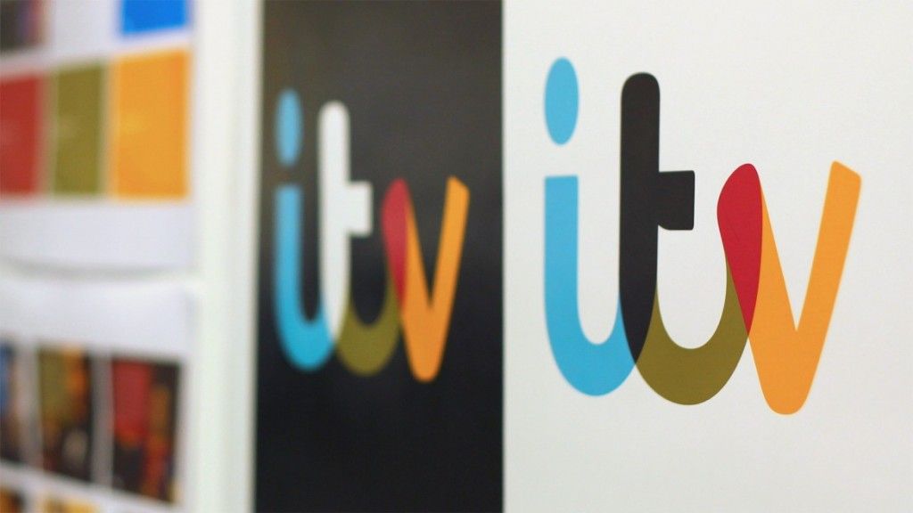
This is ITV’s first re-brand in over a decade, the original ITV logo was designed by the agency Markell Pockett in 1989 and was used all over the UK.
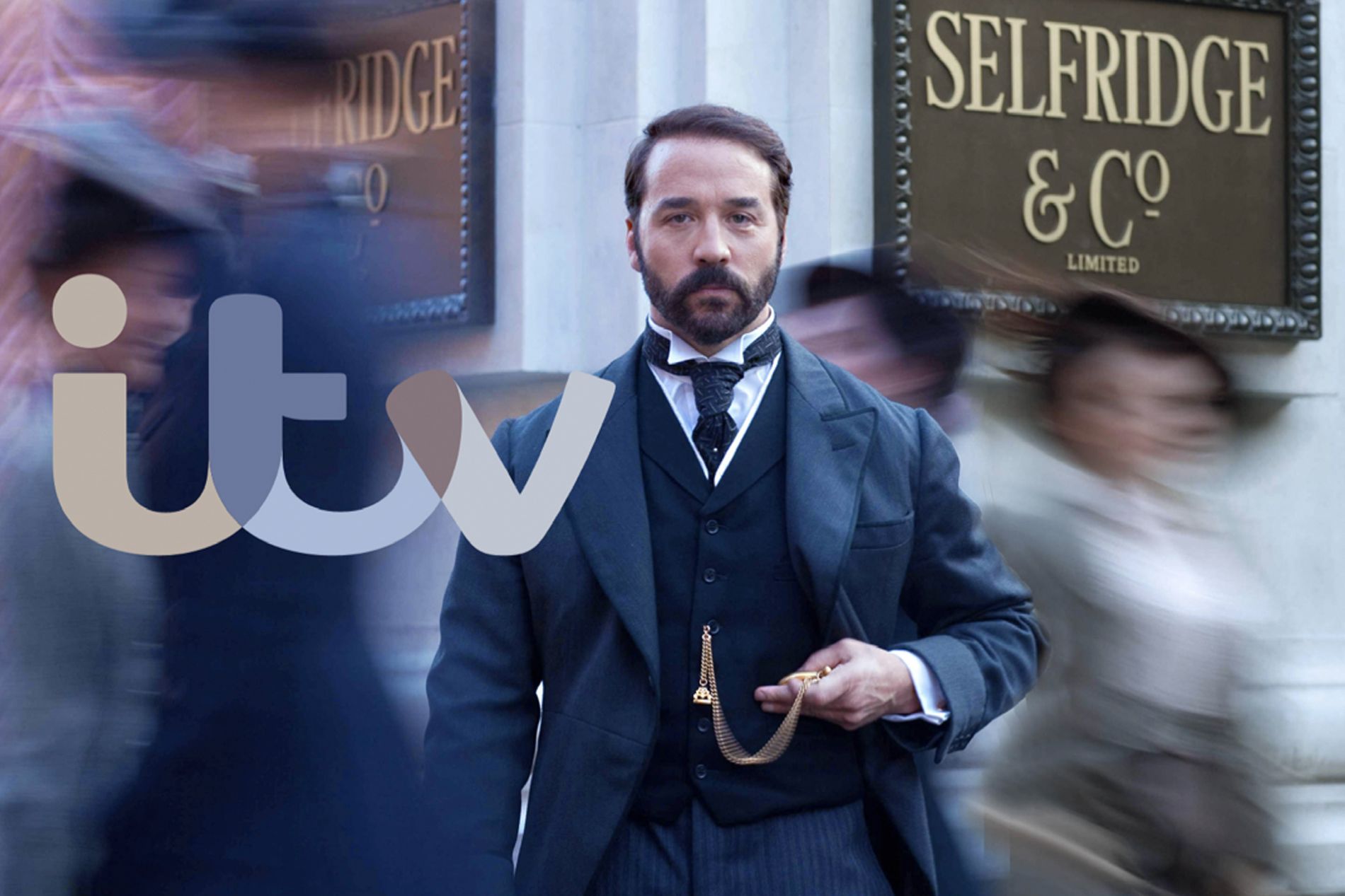
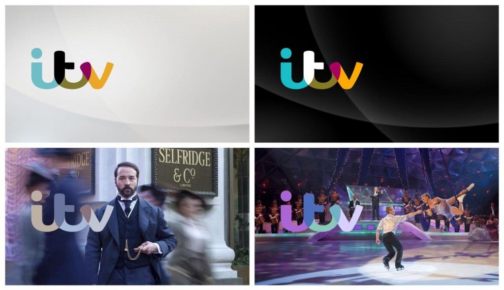
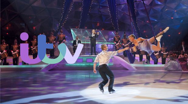
The branding was mainly worked on by ITV’s in-house creative team with some help from Rudd Studios, the new logo is designed to represent a hand-written style and the colour changes to suit the mood and tone of the programme it is advertising. The friendly curvy look will probably not be to everyones taste but it will certainly position ITV clearly, something the old identity probably didn’t achieve.
Type specialists Fontsmith also had a part to play in creating the corporate typeface ‘ITV Reem’ which accompanies the logo. As well as a new logo, ITV have opted to also gave a slight name change by dropping the ‘1’ from ITV1 to just ITV.
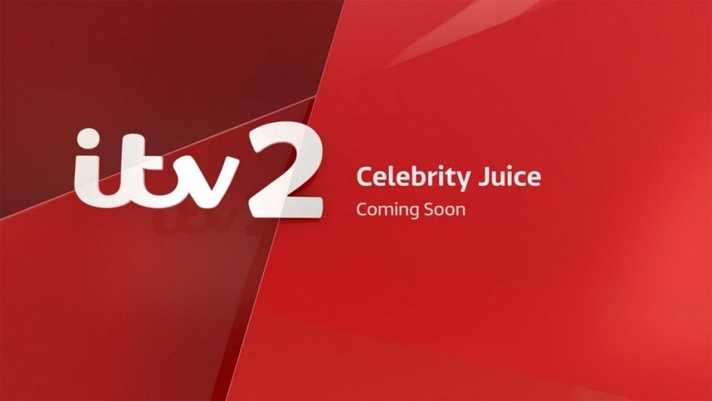
The new design is part of ITV’s multi-million pound re-brand with the aim of strengthening the ITV brand and it’s relationship with the viewers, it will also be rolled out across all five of its channels as well and various off-air and digital environments.
The new look certainly gives ITV a colourful, youthful and bolder feel and I like the flexible use of the brand across various digital and media applications.
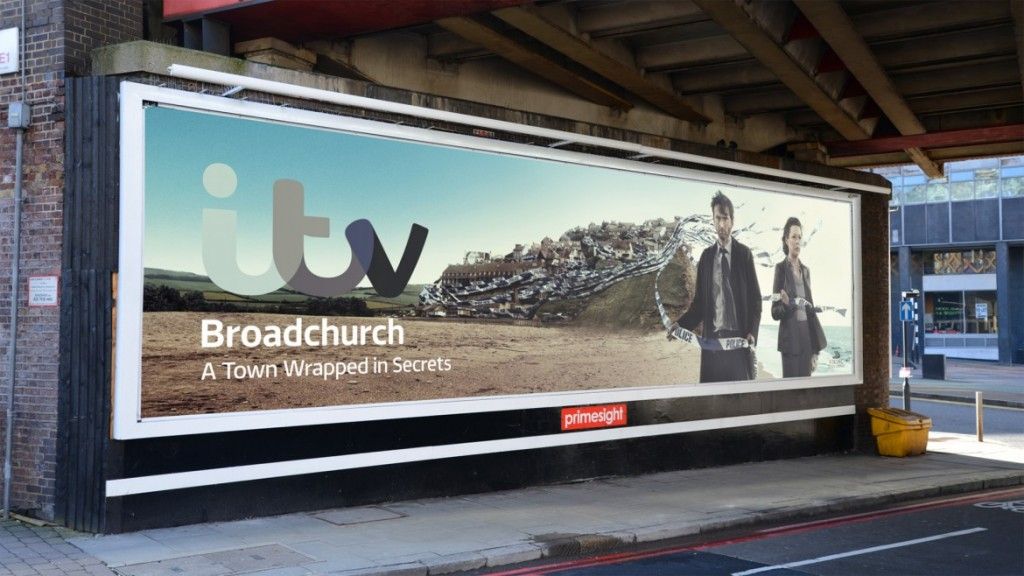
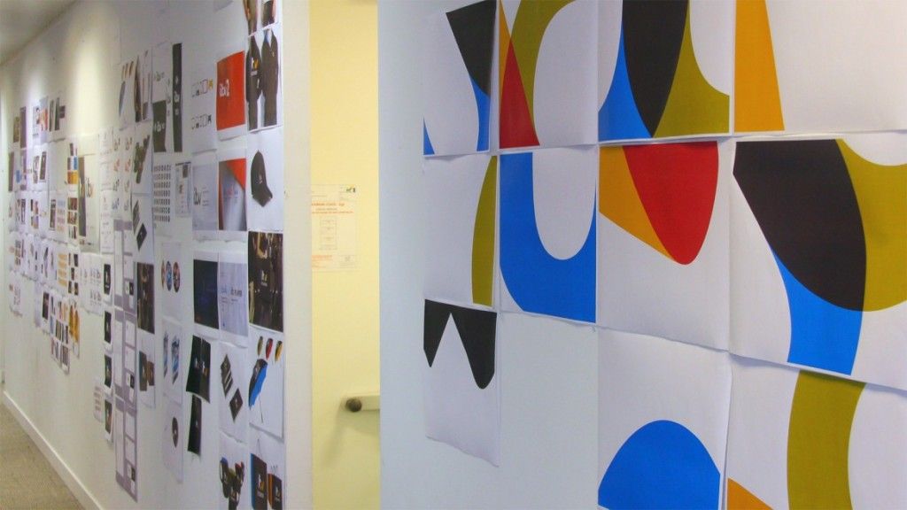
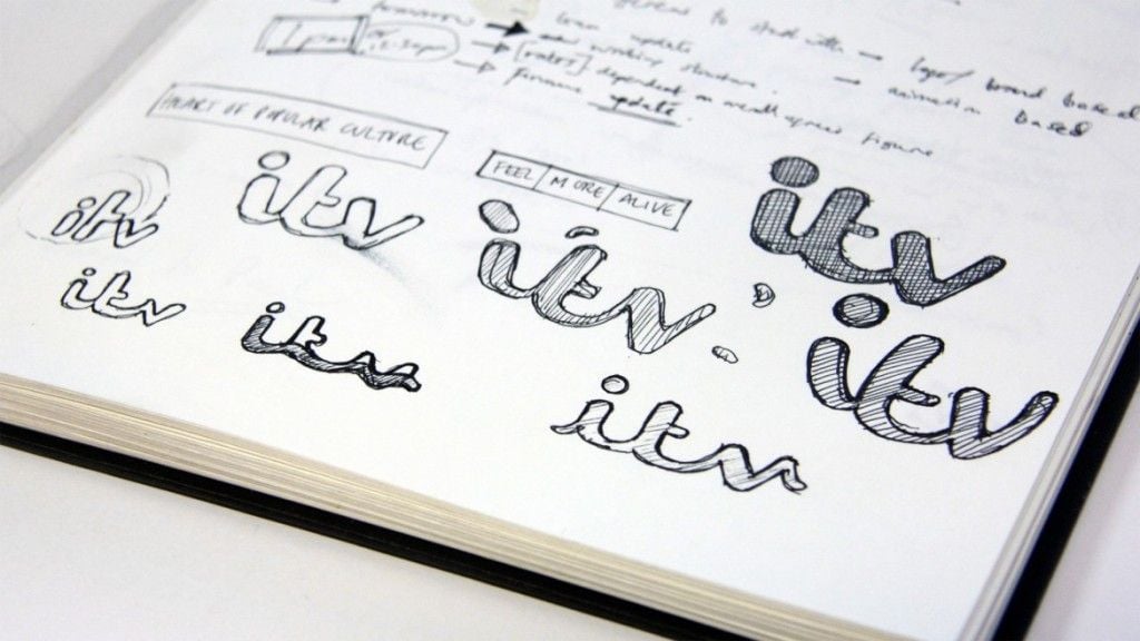
Below are some images of the new brand in use and how it all started with paper and pen!

