A redesign can be worth its weight in gold if you get it right. There is a thin line between freshening up your design, and taking a step backwards with a redesign. Sometimes a redesign can be subtle and simple, and other times it can be a huge re-vamp of a company and it’s goals. Here’s a look at some re-designs in no particular order.
01. AT&T
This is an ideal example of how a subtle upgrade can make a huge difference.
–
02. BP Garage
A completely different direction and modern feel. A huge improvement!
–
03. Sprint
Looking at the old sprint logo it’s obvious a re-design was needed.
–
04. Mindshare
A great find via Brand New. Great use of colours & typography.
–
05. Mustang 2010
The current 2008 Logo, compared to 2010. Subtle improvements, but it gives it so much more aggression
–
06. Adobe CS4
Adobe has come a long way in a short time, I like the way things are going.
–
07. Discovery Channel
A great update. Less is more.
–
08. Fanta
The old can really does look dated compared to the new look.
–
09. Johnsons Baby
Not one of the obvious choices, but I like the softer approach.
–
10. Fiat Bravo
Yeah that’s right, a car made it into the list. A great example of a successful redesign. It’s not the last car in the list either.
–
11. Steinlager
Coming from Devon I’m more of a cider drinker, but I like the redesign done here.
–
12. Applebee’s
Never been to one, but a great example of a redesign where the concept stays similar but the execution is on a completely different level.
–
13. Firefox / Firebird
I love Firefox (reasons for you to do the same here), I also love the logo.
–
14. QVC
A huge Brand, and a major revamp. And a much needed one.
–
15. Vauxhall
A UK car maker with a new, more prominent identity. I like the old one, its clean and not much is wrong with it. But the new logo reflects more on a new company direction and style of their cars.
–
16. MSNBC
A fresher look, more open and less in your face.
–
17. Ford
This is one I use a lot when speaking to clients about a logo redesign, as it’s a great update. Goes to show you don’t have to change much, to come a long way.
–
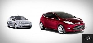
18. Ford Fiesta

I’ve never been much of a fan of the Fiesta (I have a Focus), but this on looks great.
–
19. The BBC
One of the most recognizable UK brands, good job it looks great then.
–
20. Direct TV
The same concept, shape and fonts. Just better.
–
21. Barack Obama
Topical I know, but what a difference a year makes. The 2007 site compared to the ‘08. Probably one of the best website re-designs around right now.
–
22. Grooveshark
The old one is great, the new one is better.
–
23. BusinessWeek
Simpler, Bolder, Cleaner. A successful redesign in my book.
–
24. Cloud 9
We have come along way in 8 years. And so has web design as a whole.
–
25. Toys”R”Us
A much more playful typeface and colour scheme.
–
26. Seat Leon
The old model wasn’t hideous, well maybe, but it’s only after you see the new model you start to believe it is.
–
27. N Design Studio
How to flip your website into an iconic design, courtesy of Nick La.
–
28. The BBC website
I use this site everyday, in one way or another. Words cannot describe how much I hated the old design. The new site really is something for the BBC to be proud of.
–
29. WordPress.org
I use WordPress a lot. A much more engaging and approachable design from WordPress.
–
30. Microsoft
Making something out of nothing, and doing it well. Microsoft.
–
31. MailChimp
I dare you to find a better looking mascot. A huge improvement, but a much needed one I must say, the new chimp really does have that “cute-factor”.
–
32. CNET
A subtle update, and you know I love subtle. Beautiful end result.
–
33. Wembley Stadium
When updating something so Iconic, you need to make something just as iconic. I’d say a job well done on this one.
–
34. Apple iPod
Hats off to Apple, they do make a good looking product. Even if it is over priced.
–
35. The Simpsons
Right? Now you’re including cartoons! I’m a massive fan of The Simpsons, so Yes I am. This has to go down as the redesign I’m most glad of.
–
36. XBOX
A new direction with the XBOX design, colours shapes etc are a huge leap in the right direction.
–
37. Design Shard
With a growing blog it’s important to design for the needs of your visitors
–
38. KFC
Colonel Sanders is looking better in his old age. A cleaner look. And he looks like he is working out the back!
–
39. Walmart
AKA ASDA to you and me here in the UK. A more modern feel to a logo which was showing its age.
–
40. Envato
A sleeker looking logo really can help kick off your re-branding.
–
41. Best Buy
A logo which is more fitting to the company & its products.
–
42. Macmillan
A great bold move by MacMillan Cancer care charity, but one that works really well and a very recognizable brand now.
–
43. Holiday Inn
Something about this is just so welcoming. Which is good for a Hotel company right!
–
44. British Telecom
I have no idea what that guy is blowing into, and I don’t want to know. Needless to say the new logo represents a more dynamic company, with more to offer than just horn blowing.
–
45. Vicks
The old logo very possibly was made in MS Word. You’d struggle to make the new one in Word, so I like it!
–
46. Fuel Your Creativity
They have really put a lot of thought into their new logo, and it really has paid off. The new logo has a much more lasting impact.
–
47. Amazon
For an online store like Amazon the old logo didn’t really fit. The updated version looks better in both web and print.
–
48. NTL: / Virgin Media
OK not really a redesign, more of a buy-out and brand build. Never-the less it was a refreshing moment.
–
49. Macbook Pro
Top to bottom glass front, one solid aluminium base and you’ve got yourself a pretty Macbook Pro. Well if they came down price I would :(
–
50. HP
I’ve not actually seen this used anywhere but adverts. But I really like it!
